As a seller, you always look for ways to improve your Amazon product images, packaging, and listing to boost sales. One often overlooked but critical aspect of your product is the use of colors.
Colors play a vital role in creating a first impression, evoking emotions, and influencing buying decisions. The right color choices can increase click-through rates, encourage customers to make a purchase, and build brand recognition.
Therefore, it is essential to choose colors thoughtfully and strategically for your images and packaging.
Color psychology is the study of how color affects human behavior, emotions, and cognition. Various studies have shown that colors can affect people’s moods, perceptions, and buying decisions.
For example, warm colors like red, orange, and yellow are associated with energy, excitement, and happiness. Cool colors like blue, green, and purple evoke calmness, trust, and sophistication.
Therefore, our Full Service Amazon Agency recommends understanding the impact of different colors can help you make informed decisions when choosing colors for your image and packaging design.
The Importance of Color Combinations
Choosing the right color combinations is crucial for creating an effective image and packaging design. The colors you choose can have a significant impact on click-through and conversion rates. Some color combinations work well together and are visually appealing, while others can be distracting and off-putting. As a business owner, it is important to understand which color combinations work best for your brand and product.
Good Color Combinations:
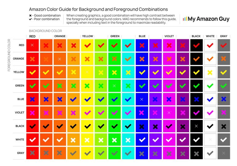
- Yellow text on red
- Black text on white
- Green text on white
- White text on blue
Poor Color Combinations:
- Orange on white
- Green on red
- Red on blue
- Blue on purple
By choosing the right color combinations for your design, you can increase your chances of attracting potential customers and making sales.
The Role of Black as a Safe Background Color
When it comes to background colors, black is a safe option that works well with almost every other color. Black is a neutral color that can create a high contrast with other colors, making them pop. However, it is important to note that blue does not work well with black. When blue is used on a black background, it can appear dull and washed out.
Choosing Readable Text Colors
In addition to choosing the right color combinations, it is important to choose readable text colors. Font size and color are critical in making text readable, especially on small product images. The following text colors work well against different background colors:
- Black text on white
- White text on black
- Yellow text on blue
- Blue text on yellow
- Red text on white
Examples of Good Color Compositions
Supplements are an example of a category with good color compositions. Most successful supplement brands have followed the rules of good color composition. For example, the use of blue and white creates a clean and professional look, while green can be used to convey a sense of health and wellness.
Tips for Choosing Colors
To summarize, when choosing colors for your product images and packaging:
- Choose color combinations that work well together and are visually appealing
- Use black as a safe background color, but avoid using blue on a black background
- Choose readable text colors that contrast with the background color
- Look to successful brands in your product category for inspiration
In addition, consider the emotions that different colors can evoke. For example, blue can convey trust and reliability, while red can create a sense of urgency or excitement. By taking the time to carefully choose your colors, you can create a powerful visual identity for your brand that resonates with potential customers.
In conclusion, color choices for Amazon product images and packaging are incredibly important for click-through and conversion rates. By choosing the right color combinations, using black as a safe background color, and selecting readable text colors, you can create a powerful visual identity for your brand that resonates with potential customers. Don’t underestimate the power of color and the impact it can have on your business. Incorporate these tips into your design and watch your sales grow.
Here is an image that we use here at our Amazon Agency as a quick reference when choosing the right combination of background and foreground colors. Feel free to use in in your design.


