Get More Clicks on Amazon

Main Image Hack

The main image is crucial for attracting potential customers. It’s the first point of contact between the customer and the product, making it essential to have a high-quality image that showcases the product’s features and benefits. Our Full Service Amazon Agency put together two videos on this topic where we highlight how it affects your listing’s success.

Need help in creating a better main image for your listing?
Request a proposal and our Amazon Experts can talk about how we can improve your listing’s images. Looking to improve your listing as a whole? Get a free ASIN review to spot other ways that will help increase your conversion rate.

Design Course for Amazon

Take the MAG School Design Course
Learn how to design better listing images, A+ content, brand stories, and even videos. Enroll Now

Improved Main Image Examples

A good main image in an Amazon listing should be visually appealing, clearly showcase the product, and accurately represent its features and benefits. We put together some of our favorite main image improvements that we’ve done for our clients, and detail the changes that were made to improve them. 
Main Image Hack BBQ Caddy
  1. BBQ Caddy
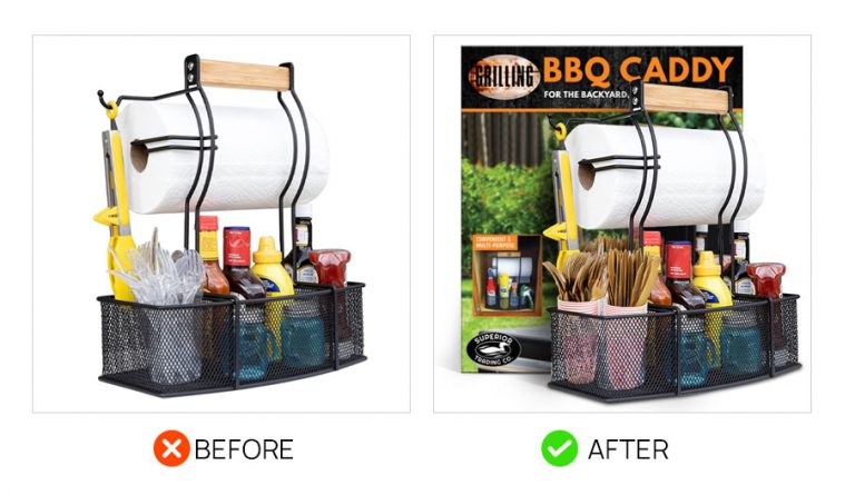
The BBQ Caddy had a main image that the standard product on a white background. However, it was too similar to the main image of competing products. The solution was to include the product packaging in the main image, and make sure that the product’s name and branding was easily readable.
Main Image Mom Spa Box
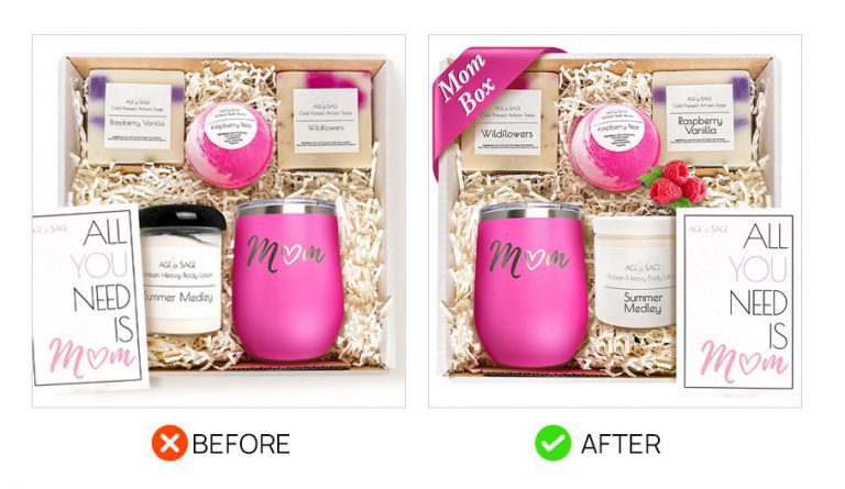
  1. Age of Sage Mom Box
This product is a boxed set of various self-care products for women, a tumbler, and a greeting card, and is intended for moms. The original main image was already a good main image, but it was improved by added a ribbon labeled with “Mom Box” on one corner. This helps easily identify the product as one for moms, and the added spot of color helps it stand out from the other products in search results.
Main image example before and after
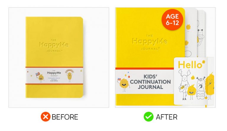
  1. HappyMe Journal
The original main image that our client had for the HappyMe Journal was a basic product shot of the yellow journal on a white background. It was a pretty standard image and majority of main images on Amazon would look like this. But we had some good ideas that we felt could help improve its conversion rate. Among them is showing what the inside of the journal looks like and placing a small note about the age bracket that the journal is intended for. Aside from that, we also placed large text in the front of the journal showing a short description of this product.
Main image example before and after
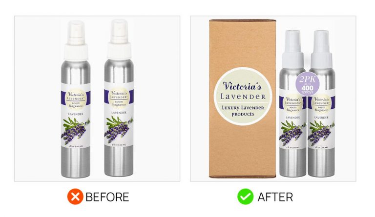
  1. Lavender Room Fragrance
Like the HappyMe Journal, the Lavender Room Fragrance Spray had a very standard main image showing two bottles on a white background. To make the image better,  we added the packaging that had their branding with the type of scent clearly visible . We also placed a badge on top of the bottles to show how many bottles are included and an estimate of how many sprays the bottles are good for.
Main Image Hack
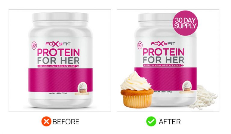
  1. Protein For Her
Protein powder products are commonly sold in jars that look similar across brands, so it’s important for their packaging to stand out and look distinct from other brands. Protein For Her takes it a bit further with the main image hack by adding a badge that mentions its content are good for 30 days of consumption, a mound of the powder, as well as an image of a cupcake to indicate its flavor.
Jacket Main Image Hack
  1. Jacket Sunscreen
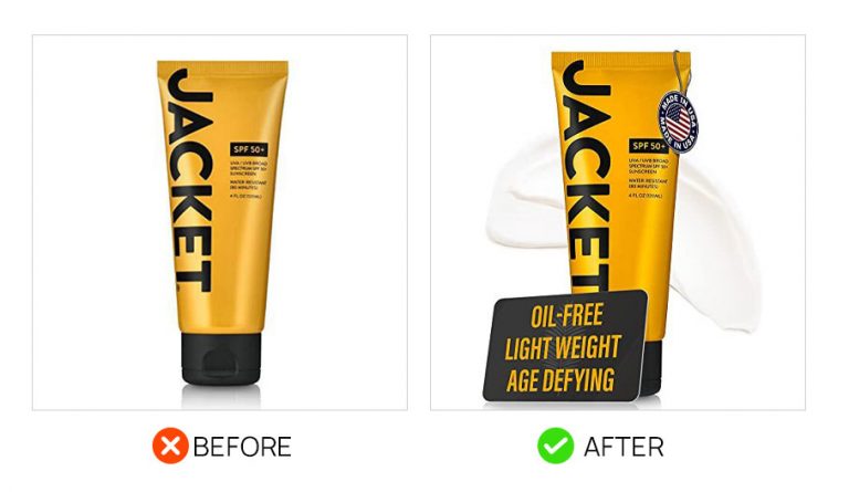
The main image for this sunscreen brand was improved in three ways. First, a card was added that listed three of the products main features. Second, a “Made in the USA” tag was added. And third, a streak of cream was shown behind the product to show what the actual cream looked like.
Coconut Water Main Image Hack
  1. Pure Coconut Water
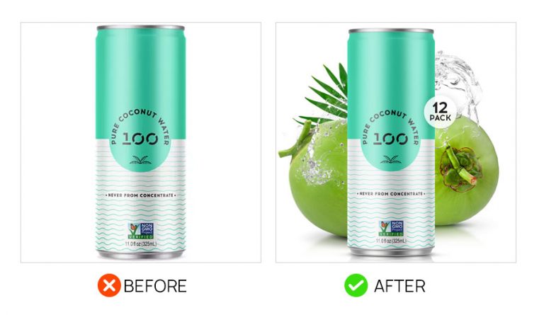
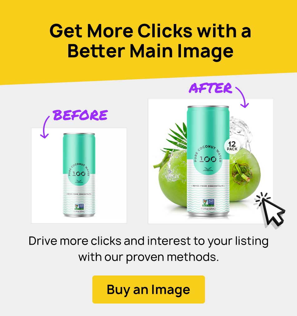
It was natural for this main image to be improved by adding imagery of coconuts and coconut water. But in addition to that, a simple badge was also placed in to show that the product is for a 12-pack of bottles.
Microwave Heating Pad Image Hack
  1. Microwave Heating Pad
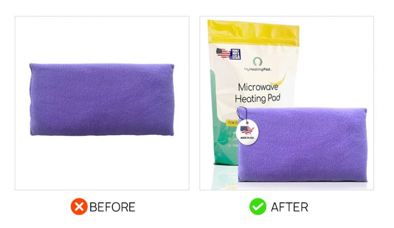
The original main image for this product was too simple, and it would be difficult for it to stand out and grab attention on a page. To improve this, we included the packaging in the main image, with the product name clearly visible, then a small “Made in USA” hangtag  was also added over the product.
Suckerbuster
  1. Suckerbuster
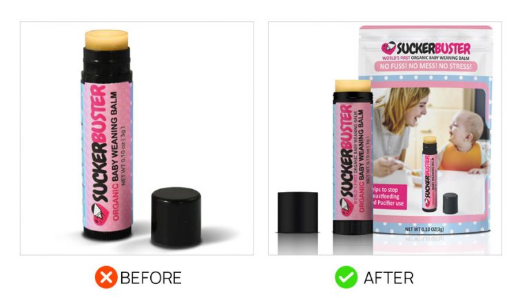
The new main image for Suckerbuster works better with the packaging, and at the same time it includes a photo that shows a mother and baby in the setting where the product will normally be used. Having people in the main image is not usually done, but since it’s part of the packaging, it looks natural, and helps make it stand out in search results.
Main Image Air Freshener
  1. Air Freshener
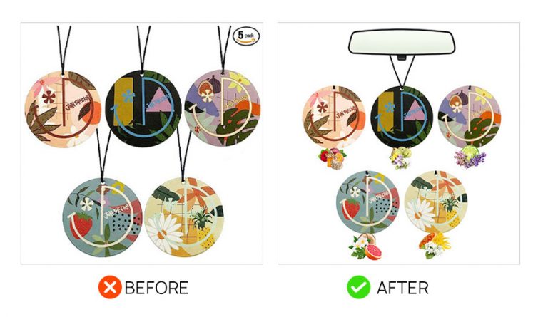
We gave this air freshener main image an upgrade by doing two things. First was to add a car rear-view mirror, where the items are intended to be hung, to provide a sense of scale. Then we added imagery to match the kind of scent that each air freshener has to give people an idea of how kind each smells. The new main image is now more descriptive by showing its approximate size and scent.
Main Image Cotton Bag
  1. Cotton Bag
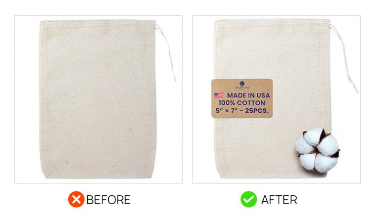
This main image needed to look more interesting to get more attention. To do this we placed in a brown tag that clearly mentions it’s dimensions, the quantity in one order, the material, and the “Made in USA” phrase. To cap it all off, we added a cotton boll to highlight that it’s made from 100% cotton.
Main Image Living Juice
  1. Living Juice
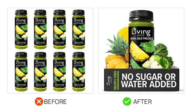
The living juice first image did show how many someone will receive upon purchase but it’s less important than showing the fruit and veggies off. Add to that the fact that someone looking for a drink like this really cares that there’s no sugar so that needed major emphasis on the front of the main image. And we slammed it via the packaging. It mentions of one of its main features, and it’s easily readable when seen in the search results page.
Main Image Eye Liner
  1. Eye Liner
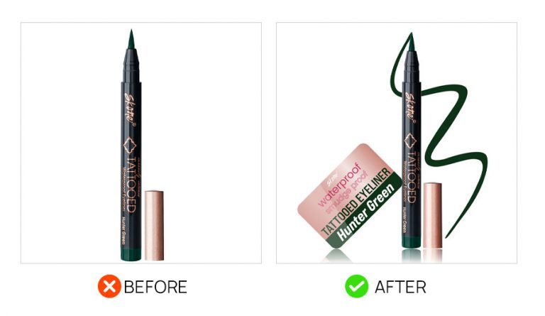
The eyeliner is drastically improved by showing off a squiggle. It seems simple at first but this eye appealing demonstration of the product shows the color and much more. It invites the user to click. Then a card was also placed in that mentions its best features and the pigment it has. And second, was placing a sweet looking dog behind the fence to communicate the product’s use and maybe get a few points for cuteness
Gate Shut Main Image
  1. Automatic Gate Closer
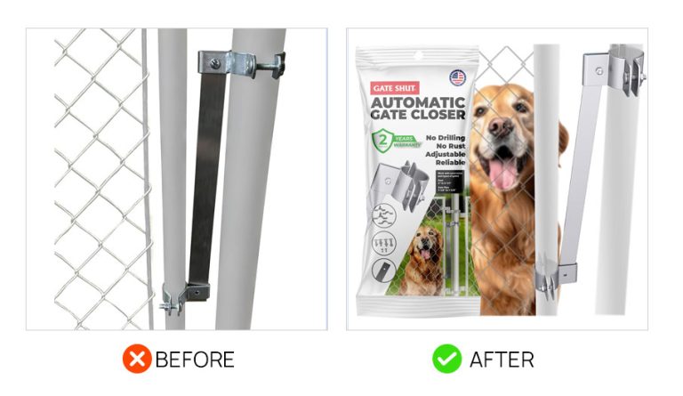
This main image was improved by making two simple changes. The first was including the packaging in the image, which displays text that describes the product, its benefits, and a sense of quality with a little “Made in USA” badge. And second, showing a dog behind the fence helps communicate a sense of scale and the product’s intended use.
Stuffed Animal Main Image
  1. Weighted Stuffed Animal
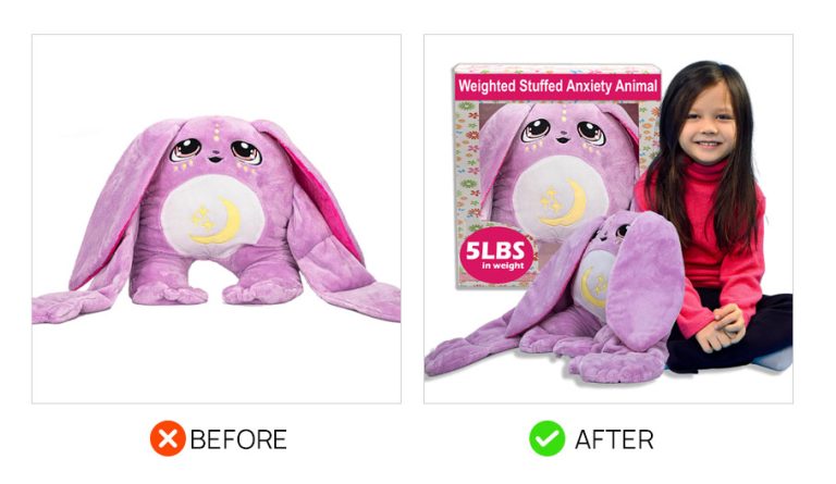
Communicating scale for products on Amazon will always be helpful for potential customers. For this product, a toddler was added to the main image does this exactly, while also showing who the stuffed animal is meant for. To cap it off, improved packaging was made and placed in to the main image to show its weight and the description of the product.
Smoke Machine Fluid Main Image
  1. Smoke Machine Fluid
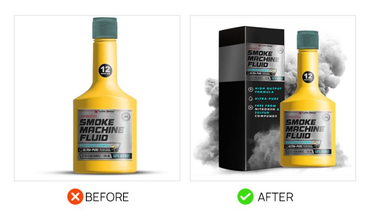
Showing what your product does is a great image to have in your listing, and we were able to that for this Smoke Machine Fluid by adding actual smoke to the main image. In addition, we also showed off the box it comes in, which lists down some of the products features. The result is a pretty cool main image with more personality compared to the original image that only shows a bottle.
Main Image Baggie Organizer
  1. Baggie Organizer
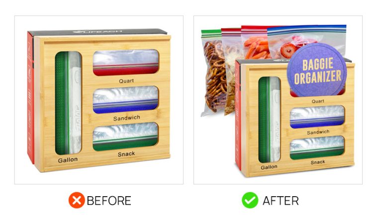
It was difficult to tell what the product was from the original main image. The fix for this was to first add a tag with text of what the product is, then we also placed in imagery of baggies with various food in them to provide context of its usage.
Timestamps:
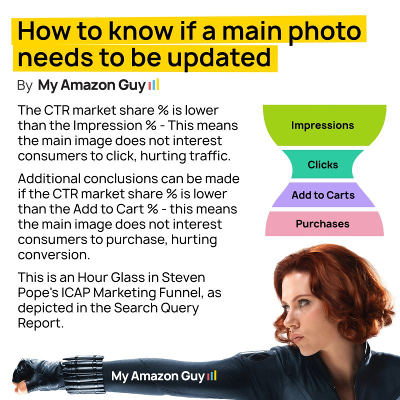
How to know if a main photo needs to be updated

Are you Struggling to Grow Sales?

Get a free professional video where we analyze your ASIN for:

0
    0
    Your Cart
    Your cart is emptyReturn to Shop