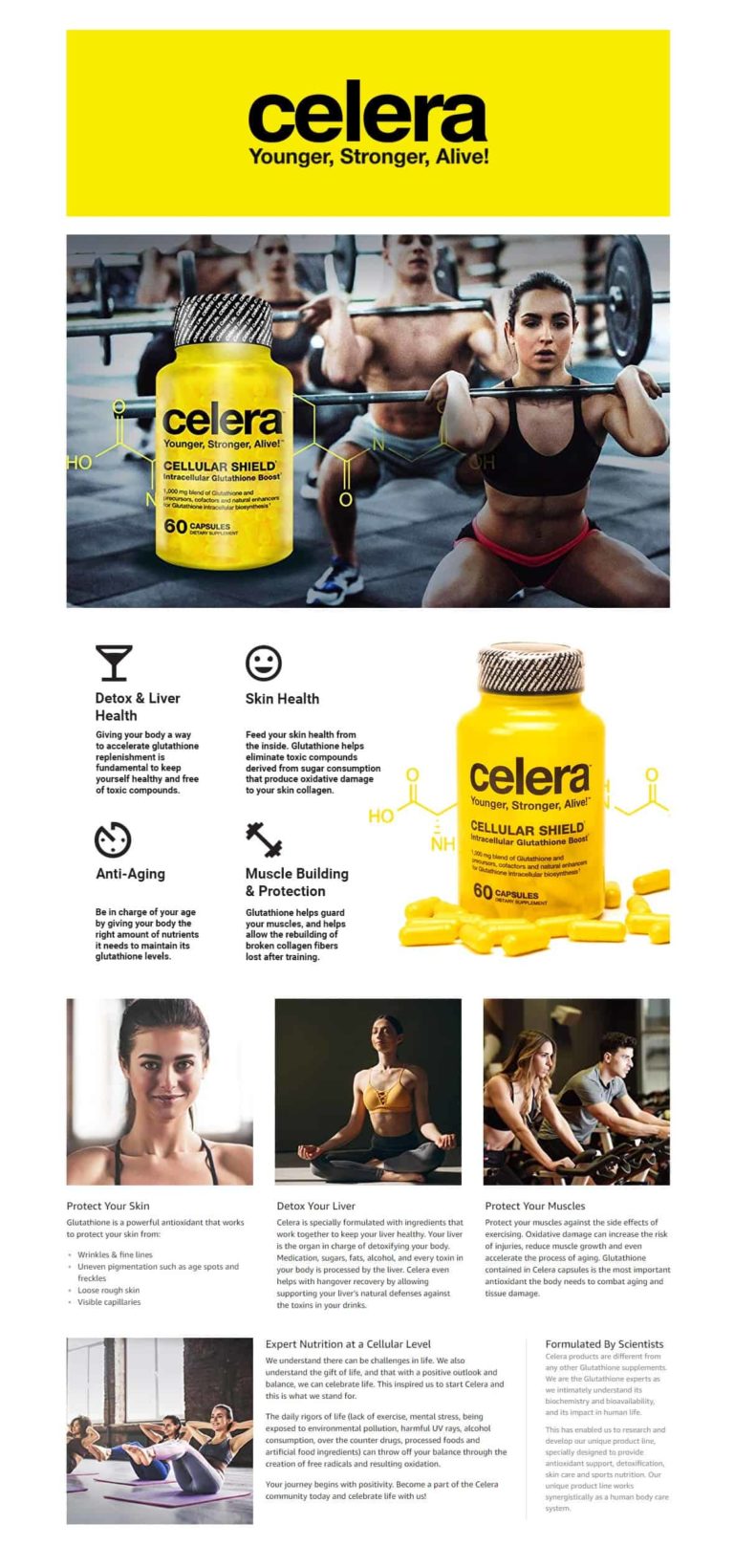
Amazon A+ Content (formerly EBC or Enhanced Brand Content) is a key factor in turning sessions into conversions. High quality A+ Content can help steer an undecided customer towards a purchase, however poor quality A+ Content can have the opposite effect.
Click here to learn how we can help you stand out from your competition and showcase your brand with Enhanced Brand Content on Amazon.
Here are a few basic tips and tricks to help you begin crafting your own A+ Content:
Getting Started
To begin creating your A+ Content, go to your Amazon Seller Central home page. A+ Content is listed under the advertising tab (A+ Content is still currently listed as Enhanced Brand Content under this tab, but this might change soon).
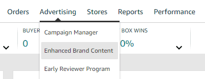
Once you click the link, you will be taken to Amazon’s A+ Content Manager. This is where your drafts will live once you save them. To start a new draft click the blue “Start creating A+ content” button in the top right corner.

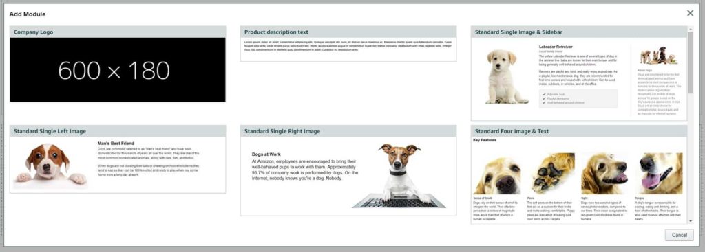
From there you will be taken to the “Content details” page. This is where you will actually build your A+ Content. You do this by selecting creating modules and filling them with either text or images. These are the building blocks of your A+ Content. The “Company Logo” and “Product description text” modules that appear when you start your build are locked and can not be deleted, however they can be left blank if you don’t wish to use them. To create new modules, scroll to the bottom of the page and hit the “+ Add Module” button. This will bring up a variety of modules to select. Choose whichever module fits your needs, and begin filling them in.
The Importance of Copy
One of the most important functions of A+ Content is that it provides an opportunity to include more keywords and searchable terms within your page. Not only can you directly input keywords attached to each image you upload, but all the copy (i.e. text) creates keywords as well. It’s important to find the balance between including a significant amount of copy in your description boxes while also being aesthetically pleasing and professional.
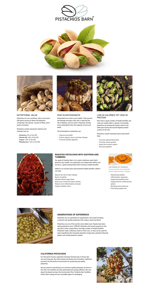
Make sure your copy is easy to read. Keep paragraphs around the same size and try to convey as much information as you can in as few of words possible. Here is a good example of appropriate copy in A+ Content:
High Quality Images
Many modules allow you to insert images. Images can convey a lot of information very quickly, and the ability to tie keywords to images when you upload them helps increase sessions and conversions. However, if you’re not careful, pictures can take away more than they add to an A+ Content page.
Every module will tell you the specific pixel height and width your image needs to be.
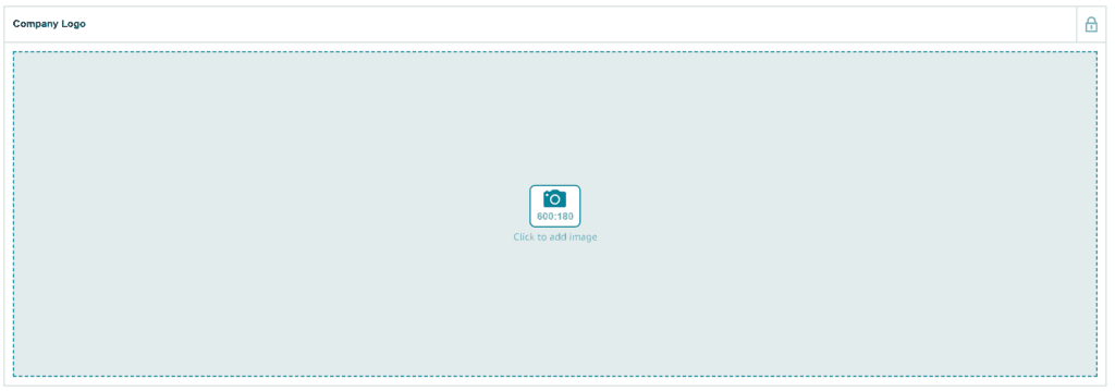
If you’re image is too small, you won’t be able to upload it. You can resize your image in a 3rd party photo editing program such as Adobe Photoshop or GIMP, but that is not recommended. Stretching your image will noticeably decrease its quality and will generally look terrible. We suggest getting the largest, highest quality images possible and only downsize them if needs be. Never increase the size of your image.
Some modules have very unique image size requirements. For example, the “Standard Comparison Chart” module requires images to be 300 pixels tall and 150 pixels wide. In cases like this, you may want to create a template in a 3rd party photo editing program with those dimensions and overlay your chosen image on it. Downsizing it to fit within your template dimensions while keeping the same scale. Below is an example of resizing a larger image to fit within a 300 x 150 pixel template:
 This should be a good jumping off point for A+ Content. Keep an eye out for Part 2.


