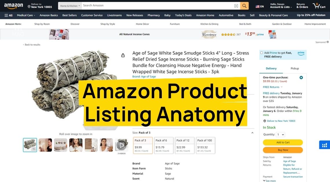
It is crucial for any Amazon seller to improve CTR. Click-through rate or CTR is a metric that directly impacts advertising performance and overall sales. A higher CTR indicates that more people are clicking on your ads after seeing them, which means your ads are more relevant and engaging to the audience.
There are many ways for increasing CTR, and one of the most effective is image optimization. Watch this video on the right explaining how optimizing your listing images will result in a boost in your click-through rates.
Amazon Catfishing with Hero Index Images
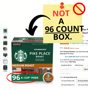
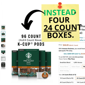
Amazon has been engaging in a practice called “catfishing” where they manipulate their main index images to entice customers. An example is a Starbucks K-Cup product on Amazon, where the hero index image shows a 96-count box, but the secondary image reveals that it’s actually four boxes of 24 counts.
Amazon understands the power of a compelling hero image to improve click-through rates and enhance the customer experience. While this catfishing strategy may seem deceptive, it is aimed at captivating customers and delivering a more engaging shopping experience.
Optimized Hero Images for the Holidays and Ordinary Days
It’s crucial to address the often neglected “hero image” on product listings, holiday or not. Many sellers overlook the importance of updating and optimizing this image, instead relying on outdated visuals that fail to drive click-through rates.
Holidays are highly active shopping events on Amazon, requiring sellers to showcase their products in the best possible light. Neglecting the hero image is akin to hiding your brand’s potential.
Why Brands Should Prioritize Their CTR
Every brand should prioritize their click-through rate (CTR) on Amazon for several compelling reasons. Firstly, a higher CTR means more customers adding products to their carts, increasing the likelihood of a purchase.
More sales directly result in higher total gross revenue, as each transaction contributes to the overall financial performance. Ultimately, increased gross revenue leads to higher total net profits, benefiting the brand’s bottom line.
By focusing on improving CTR, brands can drive customer engagement, boost sales, and ultimately maximize their profitability on the Amazon platform.
Measuring CTR
Mastering the Click-Through Rate (CTR) game can turbocharge your Amazon business, as it is the pulse of your Amazon presence and informs the algorithm that your listing deserves attention. A healthy CTR is typically above 0.3%, but aiming higher increases your chances of making a sale.
Measuring CTR is simple: go to Campaign Manager, check the ‘CTR’ column, and calculate it by dividing clicks by impressions. To improve CTR, optimize your product title with clear, concise language and relevant keywords.
High-quality images showcasing the product in use, along with highlighting benefits in bullet points, attract customers. Utilize A+ Content to tell your brand story and build trust. Experiment with different ad placements and conduct split tests to find the most effective strategies.
CTR is not just a metric; it gauges customer interest and signals relevance to Amazon. More clicks mean greater recognition by the platform.
Improve CTR Through Main Image Optimization
When it comes to selling on Amazon, your main image plays a crucial role in capturing customers’ attention and enhancing their overall experience. You can go beyond the ordinary and employ unconventional strategies to create a captivating main image that not only boosts your click-through rate (CTR) but also leaves a lasting impression.
Stand Out In The Competition With Main Image Strategies
In a competitive marketplace, your main image has mere seconds to stand out among the crowd. Consider using unconventional angles, props, or even injecting humor that aligns with your brand to pique curiosity and grab shoppers’ attention.
Instead of solely showcasing your product, aim to evoke emotions in your audience. Craft a main image that speaks to their desires, aspirations, or pain points. Incorporate visual cues, lifestyle imagery, or relatable situations that create a connection beyond a simple transaction.
When customers see themselves reflected in your main image, they are more likely to click that coveted “Add to Cart” button. By employing these strategies, you can create a compelling main image that sets your brand apart and entices customers to engage with and purchase your products.
Add A Visual Impact To Your Listing
Your main image serves as a powerful representation of your product’s value proposition. Instead of overwhelming customers with lengthy descriptions or buzzwords, let your image speak for itself.
Use visual storytelling techniques to showcase the key features, benefits, or unique selling points of your product. Remember, the power of a picture is immense, so make every pixel count in conveying your message effectively.
While Amazon has specific guidelines for main images, there exists a gray area where certain unconventional tactics can enhance the customer experience without violating any rules. It’s important to be aware of Amazon’s Terms of Service (TOS), but don’t be afraid to explore creative elements that can set your product apart. Sometimes, taking the less-traveled path can lead to remarkable and rewarding outcomes.
Level Up Your Main Image Game
If you’re ready to take your main image game on Amazon to the next level, here are some practical tips you can implement right away:
- Conduct thorough market research: Understand your target audience’s preferences and pain points to tailor your main image accordingly.
- Experiment with visual elements: Try different angles, compositions, and visual techniques to create an eye-catching main image that stands out from the competition.
- Incorporate lifestyle imagery: Use visuals that resonate with your customers’ aspirations and desires, allowing them to envision themselves benefiting from your product.
- Craft a compelling story: Showcase the value and benefits of your product through a concise and impactful narrative that can be understood at a glance.
- Test and analyze performance: Continuously monitor and analyze the performance of your main image, experimenting with variations to identify what resonates best with your target audience.
- Stay updated with Amazon’s guidelines: Ensure compliance with Amazon’s guidelines while pushing the boundaries creatively. Familiarize yourself with the rules to make informed decisions.
Merchandising your main image effectively on Amazon can significantly enhance customer engagement, increase CTR, and ultimately delight your customers. By thinking creatively, evoking emotions, and navigating Amazon’s TOS gray area wisely, you can create a main image that captivates and converts shoppers.
Main Image Best Practices to Improve CTR
Improve CTR - Add Crucial Details to Main Image
Your main image is your product’s silent salesperson. It has mere seconds to capture attention and convince potential customers to learn more. A generic image might leave viewers wondering, “What exactly is this?” Let’s dive into how crucial details can elevate your CTR.
Before & After: Sea Moss Gel Example
Imagine a product like Sea Moss Gel.
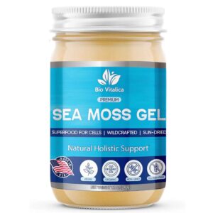
Before: A simple image showcasing a jar with a label. It doesn’t tell the whole story.
After: Keep the jar image, but add a tag highlighting crucial details! For example, “Irish Sea Moss 92 Minerals 2 Scoops a Day Made in USA.” This “after” image is much more informative.
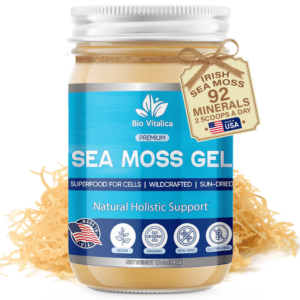
Why This Works:
- Clarity: The tag instantly clarifies what’s in the jar and its potential benefits (92 minerals!).
- Actionable Info: “2 Scoops a Day” provides clear usage instructions.
- Trust Factor: “Made in USA” builds trust and appeals to a specific audience.
By incorporating these crucial details, the after image gives a more comprehensive understanding of the product's key benefits and origins. This clarity makes the product more appealing, increasing the likelihood of attracting clicks and boosting CTR.
Improve CTR - Main Image should provide clear context
A compelling main image is crucial for increasing CTR on Amazon. It should provide clear context about what the product is, its features, and its benefits. Here’s an example:
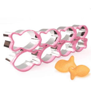
Before Image:
- Displays 8 pieces of cookie cutters and two fish-shaped cookies.
- Lacks detailed information and doesn’t fully convey the product’s value.
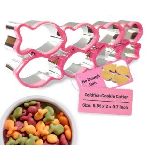
After Image:
- Shows 8 pieces of cookie cutters prominently.
- Includes a hang tag stating the benefit: “No Dough Jam” when using the cookie cutter.
- Another hang tag details the “Goldfish Cookie Cutter” with its dimensions: 5.85 x 2 x 0.7 inches.
- Features a bowl of fish-shaped biscuits to showcase the product’s results.
By highlighting the problem of dough jamming and offering a solution with the cookie cutters, a clear context of the product was portrayed along with the benefits and size.
Improve CTR - Highlight Product’s Key Points in Main Image
Your main image is like a storefront window for your product. It’s the first thing potential customers see, and it needs to grab their attention and tell them why they need what you’re selling. A generic image might not be enough.
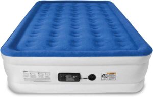
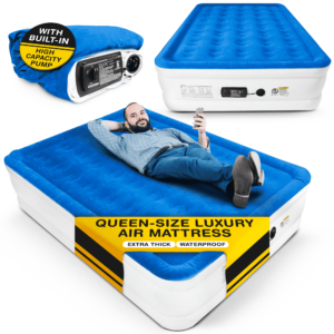
Before Image:
- Shows the air mattress itself with one side labeled, the pump, and the air inlet.
- Lacks a complete view of the product and its key features.
After Image:
- Includes the full-sized bed from the before image.
- Features a human model lying on the mattress with a label stating: “Queen-size Luxury Air Mattress Extra Thick Waterproof.”
- Displays a folded version of the air mattress with a label indicating that the mattress comes with a high-capacity pump.
This “after” image is a winner! Here’s why:
- Context: It shows the air mattress in use, creating a sense of comfort and practicality.
- Key Points Highlighted: The labels directly address key features like size, comfort level, and pump power, eliminating guesswork for the customer.
- Versatility: Seeing the folded mattress implies portability and easy storage.
This improved main image provides a comprehensive understanding of the product, showcasing its size, comfort, waterproof feature, and the convenience of the included pump. By highlighting these key points, the image becomes more attractive to potential buyers, effectively boosting CTR.
Improve CTR - Create a stronger first impression with a main image makeover
In the digital world, a product’s main image is its golden ticket. It’s the first impression that grabs a potential customer’s attention and convinces them to click for more information. A generic image might get lost in the sea of options. Here’s how an image makeover can create a stronger first impression.
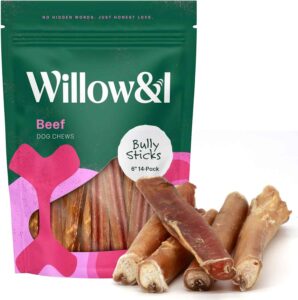
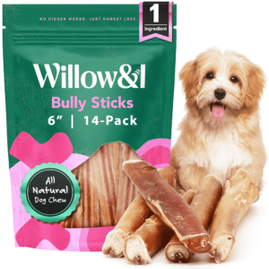
Let’s take a look at a common pet product: Beef Dog Chews.
Before: Imagine a simple image showing a resealable bag with dog chews spilling out. It lacks details and doesn’t communicate the product’s value.
After: Now, picture the same bag and chews, but with some key additions! Include badges clearly stating “1 Ingredient” and “All Natural Dog Chew.” These badges instantly highlight the product’s health benefits and appeal to conscious pet owners. Top it off with a picture of a happy dog enjoying the chew. This “after” image is a recipe for success!
Why This Works:
- Badges of Honor: The badges add instant credibility and highlight what sets the product apart from competitors.
- Emotional Connection: The adorable dog picture creates an emotional connection with potential customers, making the product more relatable and appealing.
- Clear Communication: The image clearly communicates the product’s purpose and benefits.
By investing in a main image that delivers a strong first impression, you'll see a significant improvement in your click-through rate. Remember, a few well-placed details can turn a simple image into a click magnet!
Improve CTR - Optimize main image to amplify value proposition
Let’s talk about the transformation brought about by focusing on click-through rate (CTR) in Amazon listings, using the example of a baby cereal pack from Holle baby food AG. The main image of the product needed improvement, as it didn’t clearly convey important details.
To fix this, a plain box with a visible ‘6-pack’ label was added, amplifying the value proposition and making the deal more enticing. Additionally, the prominence of the whole grain aspect was enhanced to catch the attention of health-conscious consumers.
Transparency was prioritized by including an image of the actual product, which builds trust with potential buyers. Despite the general recommendation of emphasizing US origin, the exceptional quality associated with Germany was highlighted.
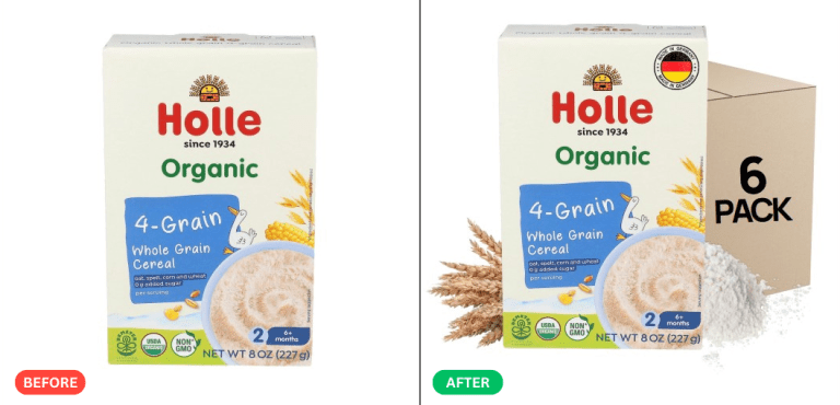
Optimizing the main image to amplify the value proposition is crucial for sellers because it boosts CTR. A clear, compelling image highlights key benefits, differentiates the product from competitors, and meets shopper needs, driving more traffic and revenue.
Improve CTR - Showcase your main image to appeal to shoppers’ needs and preferences
Your main image is more than just a pretty picture – it’s a conversation starter with potential customers. A generic image might not resonate with their specific needs and preferences.
Here’s how to create a main image that speaks their language and drives clicks.
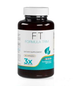
Before Image:
- Displays a bottle of the dietary supplement.
- Lacks detailed information that speaks to shopper needs.
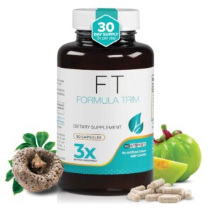
After Image:
- Shows the same dietary supplement bottle.
- Adds a badge stating “30 Day Supply, 3x per Day” to highlight usage and value.
Why This Works:
- Clarity on Benefits: The badge instantly clarifies how long the bottle will last and the recommended dosage.
- Reduced Friction: This information eliminates the need for shoppers to search for dosing instructions, reducing friction in the buying journey.
- Appeals to Busy Lives: The “30 Day Supply” badge speaks to a shopper’s desire for convenience and eliminates the worry of running out too soon.
A main image that fails to address shoppers' needs and preferences can lead to poor engagement and conversion rates. This image makeover effectively appeals to shoppers by providing clear information on the product's duration and dosage, directly addressing common questions and preferences.
Improve CTR - Prominently display the product for transparency and credibility
Here’s John’s test concept edit for Beetroot Black Cherry powder on Amazon, and the transformative power of small changes is astonishing!
- Prominently displayed the powder itself in the main image, ensuring transparency and credibility.
- Emphasized the Black Cherry flavor for an enticing impression of a cherry paradise.
- Highlighted the value by clearly stating the 30 servings on the canister, showcasing its affordability.
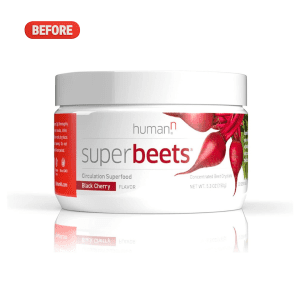
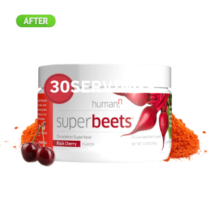
Prominently displaying the product builds trust and credibility with buyers. This transparency, combined with clear information on flavor and servings, makes the product more trustworthy and appealing.
Improve CTR - Add color swatches to the main image tag
A 2-pack Silicone Spatula Set is used in this example. By adding color swatches to the tag in the main image, customers get a VIP product tour that visually communicates variety and choice.
Highlighting that it’s a ‘2-Piece Set’ provides clarity on the quantity, enhancing perceived value. Combining these strategies transforms the main image into a powerful silent salesperson, inviting customers with a clear understanding of what they’re getting and the good deal they’re receiving.
Clarity, communication, and customer experience are the keys to Amazon success, and a few tweaks can significantly boost CTR, drive conversions, and make sellers happy.
Adding a tag with color swatches to a main image can improve it by providing clear and immediate information about available color options, enhancing the visual appeal, and aiding in decision-making. This addition makes it easier for shoppers to see their choices at a glance, increasing the likelihood of engagement and boosting CTR
Improve CTR - Emphasize Amazon-acceptable product details
This is Zarbee’s Kids Melatonin Gummies and here are ways to improve the main image.
- Enlarge the age range to highlight its suitability for 3-year-olds and up, appealing to wandering parents seeking a solution.
- Show the gummy in all its glory, increasing trust and making it look like an enticing treat.
- Flaunt the “Natural Berry” flavor, a kid-approved feature that can be the golden ticket to winning hearts.
While the supply count isn’t emphasized due to its nature as a sleep aid (a risky detail that might lead to suppression or listing removal), these three tweaks make the product listing stand out and appeal to parents seeking bedtime peace for their little ones. Well-rested kids mean well-rested parents, creating a win-win situation.
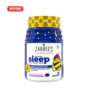
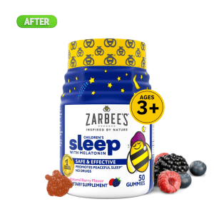
When optimizing a main image for CTR, emphasizing Amazon-acceptable product details ensures compliance and boosts credibility. Highlighting key aspects like dimensions and features aligns with Amazon's guidelines, enhancing visibility and trust with potential buyers.
Improve CTR - Use bold colors and engaging overlays for a standout hero image
The product in focus is Scotts Turf Builder Triple Action. The “Before” image is unclear and fails to showcase the product effectively. However, the “After” transformation is vibrant and attention-grabbing, clearly displaying the Scotts Turf Builder Triple Action, a 3-in-1 superhero for lawn care, covering 4,000 sq ft.
The importance of Click-Through Rate (CTR) on Amazon is emphasized, as a high CTR leads to increased visibility and greater chances of conversions, propelling sales to new heights. Pro tips for stellar CTR include designing a standout hero image with bold colors and striking visuals to capture attention.
Additionally, highlighting key features through engaging text overlays or clear visuals helps customers understand the product’s unique selling points.
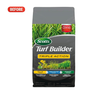
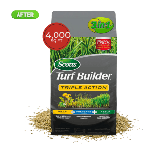
Using bold colors and engaging overlays in a hero image enhances visibility and attracts clicks by quickly capturing attention. This visual strategy distinguishes the product, increases engagement, and improves click-through rates effectively.
Improve CTR - Utilize all 6 listing image slots, A+, and customer avatar
Wuffes could greatly benefit from some improvements in their product listing.
- They should make use of all six image slots to showcase their product in action, allowing customers to see and understand why their joint supplements are the best choice. Vibrant images, before and after comparisons, or side-by-side comparisons with competitors would enhance the visual appeal.
- A+ Content needs to be more impactful and dog-specific, focusing on how Wuffes can improve older dogs’ lives with their chewable supplements. Making the content about the dogs and their needs, rather than generic information, will have a greater impact.
- They should create a customer avatar of loyal pet owners with aging dogs, portraying them as loving caregivers who want to ensure their furry companions’ comfort in their golden years. Incorporating these improvements will help Wuffes present a stronger and more engaging presence on Amazon, enticing potential customers to choose their products for their beloved pets.
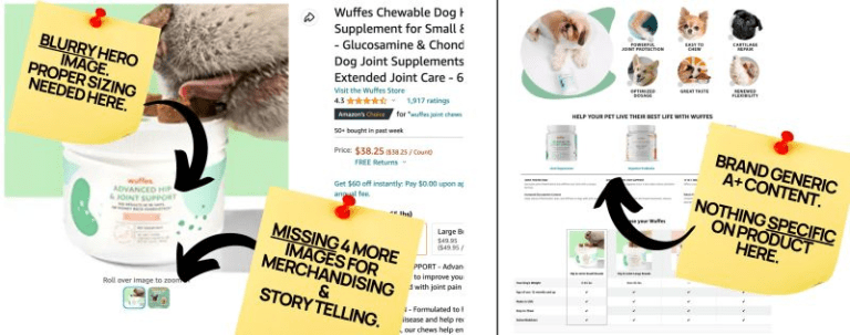
Utilizing all 6 listing image slots and A+ content alongside understanding the customer avatar maximizes Amazon CTR by presenting a complete visual narrative of the product's advantages tailored to the target audience. This strategy enhances appeal, encourages engagement, and drives higher click-through rates effectively.
Improve CTR - Add catchy sticker
In the exciting world of FoxyFit Protein for Her, a few strategic tweaks can turn a solid product listing into a conversion powerhouse. The 1-2-3 strategy includes adding a catchy Call to Action sticker, showcasing customer avatar lifestyle photos to demonstrate the product in action, and highlighting the ingredients and flavor with enticing visuals.
A sticker like “30 DAY SUPPLY” or “SUGAR-FREE FORMULA” grabs attention. Lifestyle photos of confident women enjoying the protein powder in a healthy, active setting help potential customers envision its seamless integration into their lives.
Large, colorful images of the all-natural ingredients and delicious vanilla flavor make buyers crave the product. By showcasing the right details, FoxyFit Protein for Her can soar in the competitive e-commerce jungle.
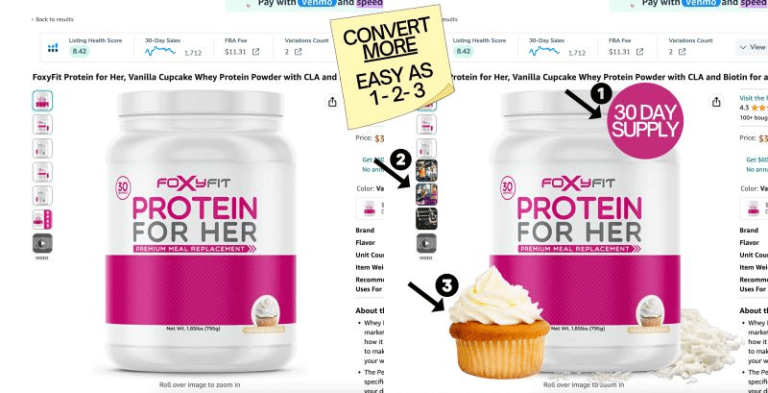
Adding a catchy sticker with a prompt message and keywords helps optimize the main image for CTR by grabbing attention and prompting engagement, effectively boosting conversions on Amazon.
Improve CTR - Make captivating main image with clear information to reduce scroll fatigue
In the crowded sea of Amazon products, the “before” image of New Mood fails to stand out and provide essential information. The capsule size, ingredients, and value proposition are unclear.
However, the “after” image showcases a transformation with visible measurements, transparent ingredient details, and a value prop sticker declaring a “30-day supply.” These changes are crucial as standing out in the competitive marketplace is essential.
With clear information and a captivating image, products can guide customers toward their desired benefits, such as stress relief, better sleep, and improved moods, and create a memorable shopping experience.
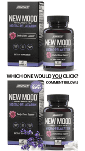
Creating a captivating main image with clear information reduces scroll fatigue and boosts CTR by quickly grabbing attention and providing relevant details to potential buyers.
Improve CTR - Perform Main Image A/B Test for maximum CTR
Watch this video I explain about the importance of A/B testing your main image.
Performing a Main Image A/B Test for maximum CTR matters as it helps sellers identify the most effective image variant, optimizing elements like layout and colors to increase click-through rates and improve sales on platforms like Amazon.
Amazon Compliance
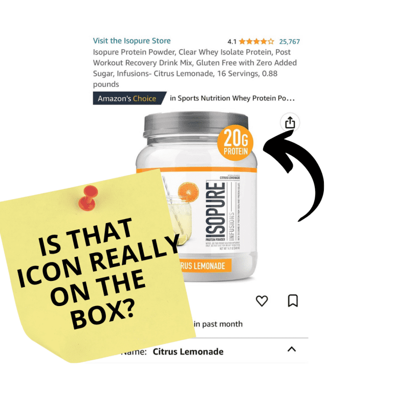
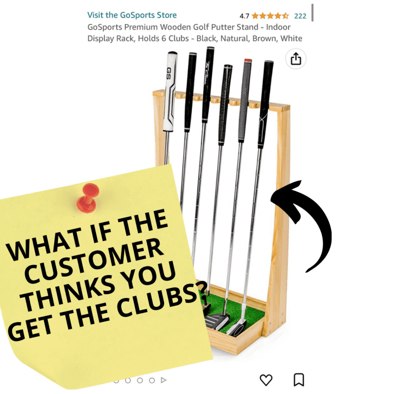
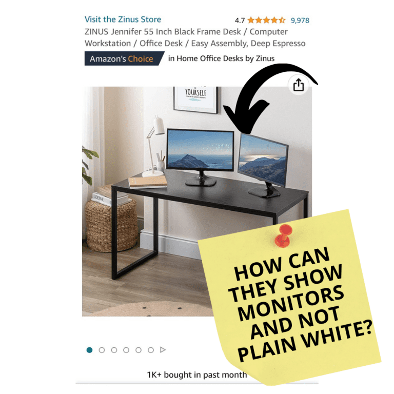
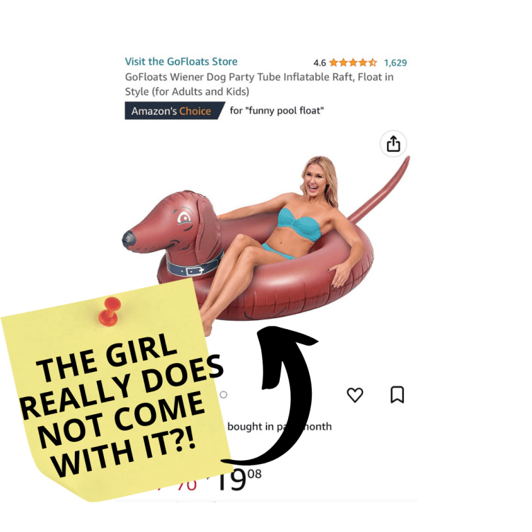
Will these strategies get me in trouble with Amazon? As John explained, a strategy is a winner if it can positively enhance customer experience.
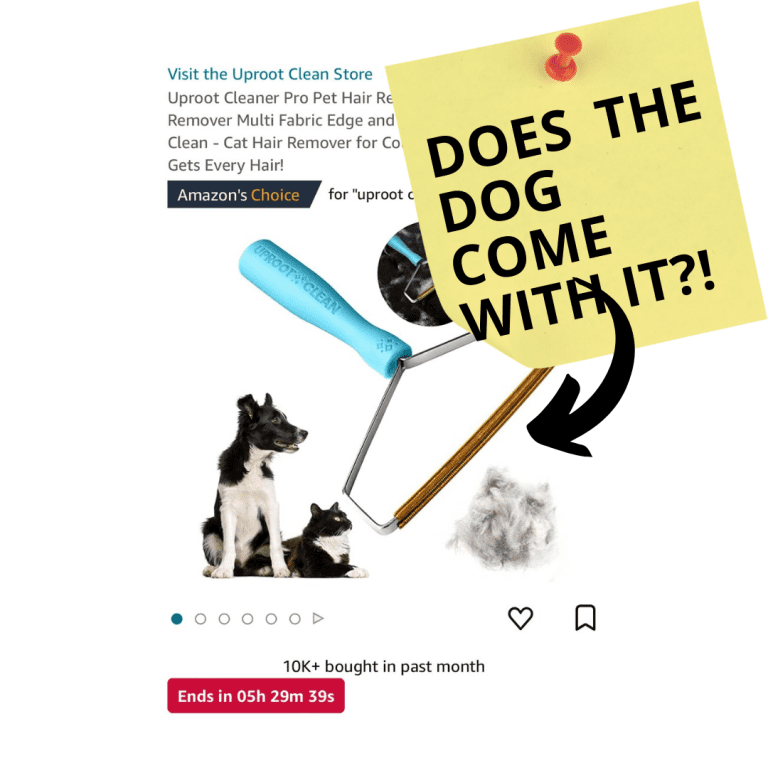
Below are some of Amazon’s vetted daily deals that show additional elements in their hero images.
Conclusion
Optimizing your main image can significantly improve your click-through rate (CTR). By A/B testing different images and analyzing the search term report, you can identify which images drive the most clicks and conversions.
This optimization can help grow sales on Amazon quickly because a high CTR increases visibility in search results, leading to more traffic and potential customers.
Additionally, a captivating main image can attract customers’ attention, build trust, and showcase the product’s key features, ultimately driving more sales.


