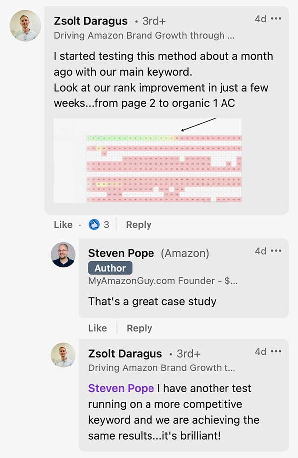
Upgrade Your Main Image CTR
Is your main image attractive enough to generate clicks from the search page? Make a good first impression and have more shoppers discover your products on Amazon.
- $100 per main image
- Photo editing and compositing
- Deliverables: final main image and all raw and edited files used
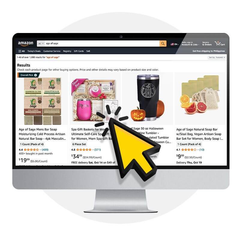
Improve Search Ranking and Get More Clicks
Click Through Rate: Making Every Click Count
CTR measures the percentage of users who click on your product listing after viewing it from search.
CTR plays a crucial role in driving traffic which leads to more sales.
- Lower PPC ACOS
- Higher SEO Rankings
CTR is not just a vanity metric; it has a direct impact on your bottom line. A high CTR signals that your product listing is compelling, engaging, and relevant to shoppers. It means that more potential customers are intrigued by your product and are actively interested in exploring further. By increasing your CTR, you enhance your chances of turning browsers into buyers, boosting sales, and outperforming your competition.
Improved Main Image Examples
A good main image in an Amazon listing should be visually appealing, clearly showcase the product, and accurately represent its features and benefits. We put together some of our favorite main image improvements that we’ve done for our clients, and detail the changes that were made to improve them to help increase their CTR.
Sage Sticks
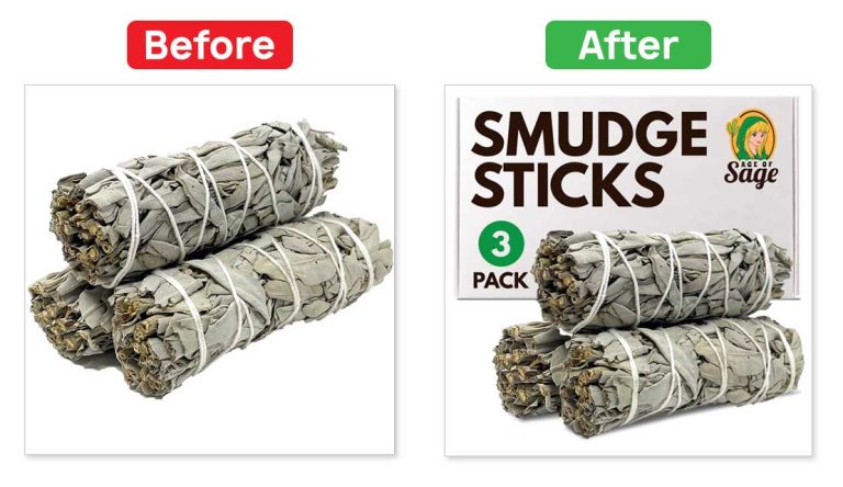
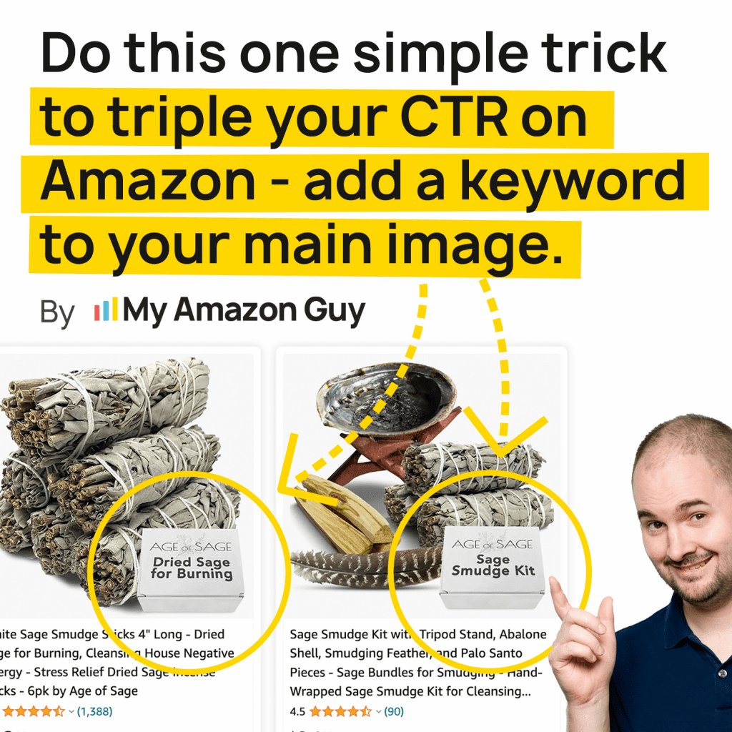
Steven’s own Age of Sage product needed a CTR upgrade. It’s amazing what adding a box, logo, 3 pack call out, a keyword, and some color can do.
Cookie Baking Sheets
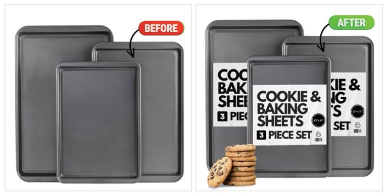
You can smell the difference. Simply adding cookies and a sticker on the pan with a keyword that shows what the product can be used with makes this stand out. Adding the 3 piece set also helps consumers understand what they are getting quickly.
HappyMe Journal
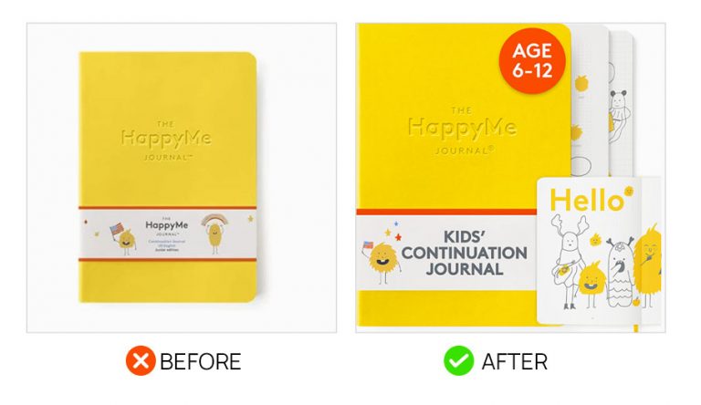
The original main image that our client had for the HappyMe Journal was a basic product shot of the yellow journal on a white background. It was a pretty standard image and majority of main images on Amazon would look like this. But we had some good ideas that we felt could help improve its conversion rate. Among them is showing what the inside of the journal looks like and placing a small note about the age bracket that the journal is intended for. Aside from that, we also placed large text in the front of the journal showing a short description of this product.
Result: 3x CTR and 3x sales. With no other changes to the product page or PPC.
Living Juice
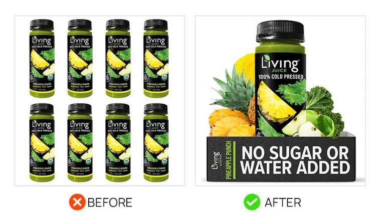
The living juice first image did show how many someone will receive upon purchase but it’s less important than showing the fruit and veggies off. Add to that the fact that someone looking for a drink like this really cares that there’s no sugar so that needed major emphasis on the front of the main image. And we slammed it via the packaging. It mentions of one of its main features, and it’s easily readable when seen in the search results page.
Solawave
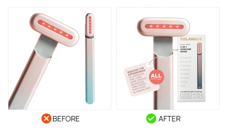
Adding a box helps consumers understand it’s a real brand. The text additions emphasize the key FAQs customers have anxiety about such as skin type.
Microwave Heating Pad
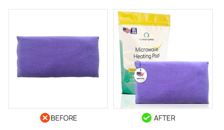
The original main image for this product was too simple, and you can’t even tell what it it is. It would be difficult for it to stand out and grab attention on a page. To improve this, we included the packaging in the main image, with the product name clearly visible, then a small “Made in USA” hangtag was also added over the product.

Take the MAG School Design Course
Design better listing images, A+ content, brand stories, and even videos. Enroll Now
Improve CTR through Main Image Optimization
The main image is considered one of the greatest contributors to click-through rate (CTR) on Amazon. The main image is usually the first visual that potential customers see when browsing through search results or product listings. It plays a crucial role in attracting attention, conveying the product’s features and benefits, and ultimately convincing shoppers to click on the listing. Let’s focus more on optimizing the main image to improve CTR.
To improve your CTR through main image optimization, there are several strategies you can implement:
- Perform A/B testing: This involves testing different main images to see which one generates the highest CTR. Create variations of your main image and rotate them to determine which one resonates best with your target audience. Analyze the data and choose the image that performs the best.
- Optimize for relevant keywords: Use Amazon’s search term report to identify the keywords that are driving traffic to your listing. Ensure that your main image is optimized for these keywords by including them in the image title, alt text, and even within the image itself if possible. This will help your listing appear in relevant search results and attract more clicks.
- Spy on competitors: Utilize tools like Helium10 to gather insights on your competitors’ main images. By analyzing what is working well for them in terms of high CTRs, you can gain inspiration and ideas for your own main image optimization. However, always remember to create unique and compelling images that differentiate your product from competitors.
- Focus on quality and aesthetics: Your main image should be visually appealing and of high quality. Use professional product photography to showcase your product in the best possible light. Consider the composition, lighting, and overall design to create an image that stands out and captures the attention of potential customers.
- Highlight key product features: Your main image should clearly communicate the unique selling points and key features of your product. Use annotations or callouts to highlight important details that can help persuade customers to click on your listing. Make sure the main image accurately represents what the customer can expect from your product.
Optimizing your main image for CTR is an ongoing process. Continuously monitor and analyze the performance of your main image, and make adjustments as necessary to improve your CTR over time.
Timestamps:
- 00:00 Why CTR is the Most Important Factor
- 00:50 Enhance Product Appeal and Click-Through Rate (CTR)
- 02:34 The Impact of Improved Main Images on SEO and Rankings for Amazon Listings
- 03:37 Conveying Product Information through Main Images
- 06:35 Differentiating Your Product
- 09:01 Strategic Visual Elements and Messaging
- 10:16 Leveraging Search Query Performance and Brand Analytics
- 13:55 Leveraging Effective PPC Ads

Committed to Helping Amazon Sellers
Steven Pope and MAG specialists hold weekly Q&A sessions with Amazon sellers, answering their Amazon questions, all for free. Check out some of previous sessions on our YouTube channel, or join us on the next live Q&A.

What Sellers are Saying
Hundreds of Amazon FBA sellers flock to us for thought leadership, account management, and more. Here’s what some of them have to say.


Swipe to see more
Swipe to
see more
More Image Examples that 2x CTR on Amazon
Manuka Oil
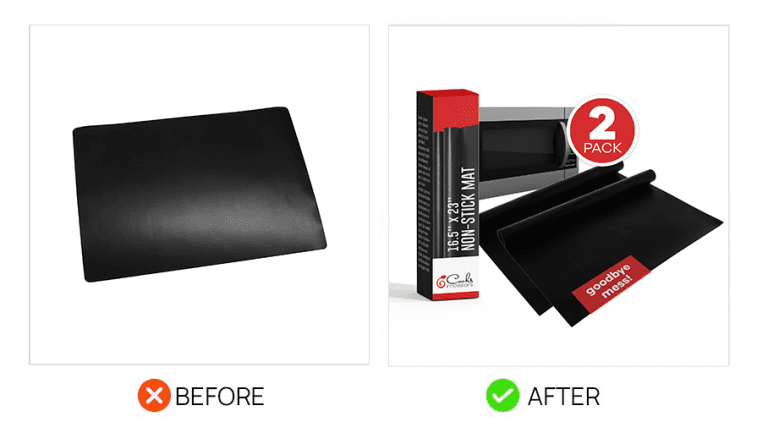
Non Stick Mat
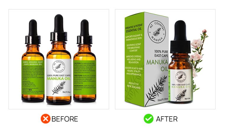
Added packaging and a live ingredient.
Added 2 pack symbol, packaging, a microwave and keywords.
Knee Brace
Your Image
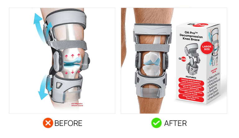

Added packaging, a better model, and big emphasis on LARGE size.
Be our next success story and order your image now.

